

Have you ever wondered how to make a maroon color with acrylic paint? If you’ve ever tried to capture the deep, rich tones of maroon in your artwork, you know it’s not just about grabbing a tube of paint from the store. Sure, you can buy a pre-mixed maroon, but where’s the fun in that? Mixing your maroon not only gives you a better understanding of color theory but also lets you create a shade that’s uniquely yours. Let’s dive into the world of maroon and explore the various ways to achieve this beautiful color.
The History of Maroon
Before diving into making maroon, let’s take a little detour through history. The term ‘maroon” is derived from the French word “marron,” meaning chestnut, and the Italian word “marone,” referring to both chestnuts and the color brown. First documented in English in 1789, maroon is often described as a red-brown or dark red-purple color depending on the dictionary you use.
Essentials for Mixing Maroon
To mix maroon yourself, start with a primary red such as Cadmium Red Light or Medium, or Primary Magenta. When adding darker colors into the red (green, blue, purple, black) try to use them sparingly to ensure the color doesn’t get muddy and dark. In the examples below, I used the following colors:
- Cadmium Red Medium
- Carbon Black
- Phthalo Blue
- Cadmium Yellow Medium
- Permanent Green Deep
- Cadmium Orange
- Dioxazine Purple
If you want to learn more about why I use these colors, I lay it all out in my guide on “8 Colors Every Artist Must Have.”
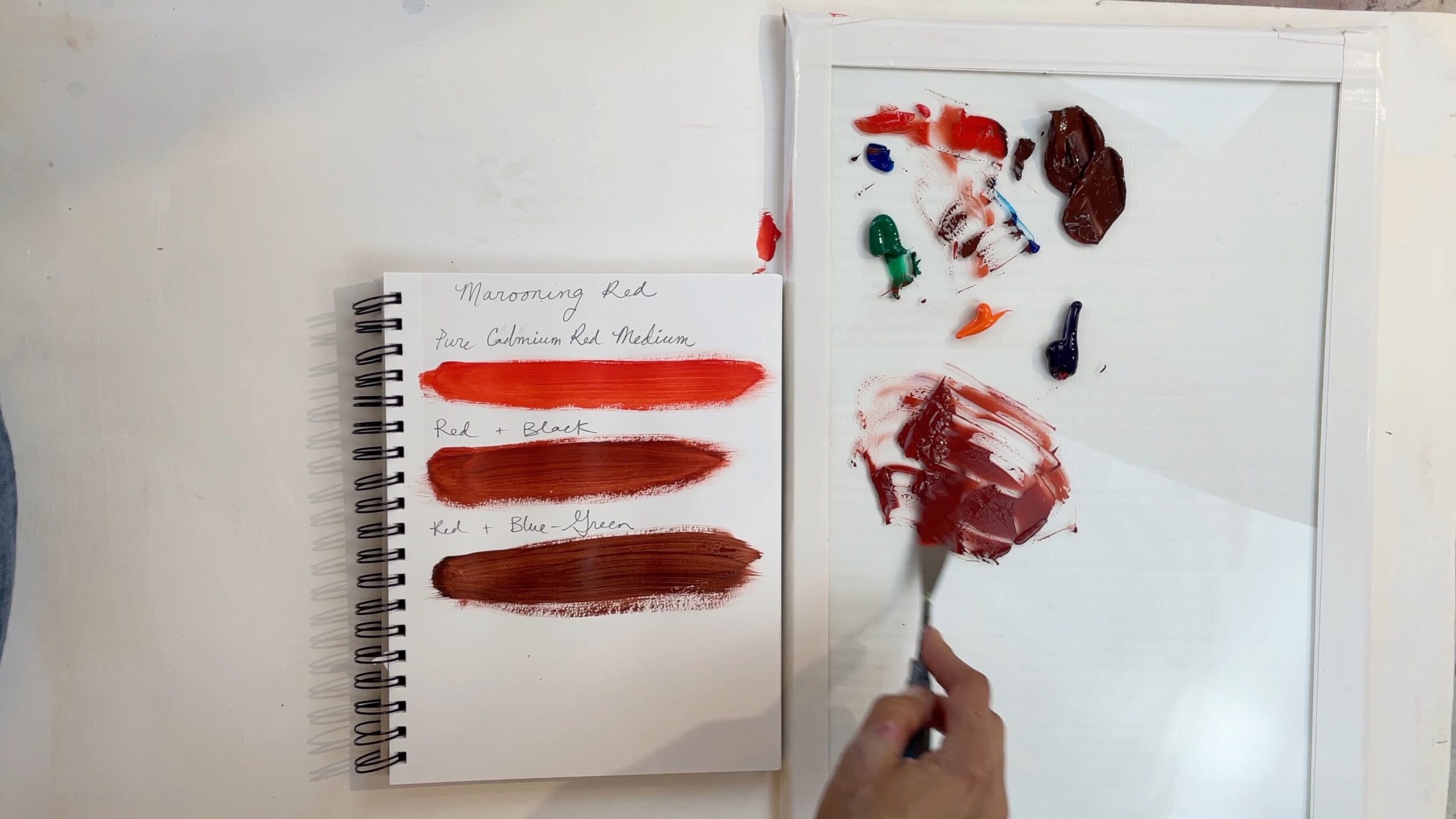
The Simplest Method: Red + Black or Red + Brown
One of the easiest ways to make maroon is by combining red and black or brown. Be cautious since black is the darkest color; a little goes a long way. This method is straightforward but might not offer the warmth or variation that more complex mixes provide.
I prefer being able to push my color to be warmer or cooler, however, and that’s why I prefer to use the primaries or secondaries to mix maroon as opposed to black or brown.
The Primary Colors Method: Red, Blue, and Yellow
For a more nuanced maroon, try mixing the primary colors: red, blue, and yellow. I like to begin with a red base, and then add a small amount of blue to darken the color. I then introduce yellow to warm the color and lighten it a bit as well. This method allows for more control and variation on how warm I want the color to be. As you can see, red, blue, and yellow make a beautiful neutralized red that can have a plethora of variations depending on how much yellow or blue you add to the mix.
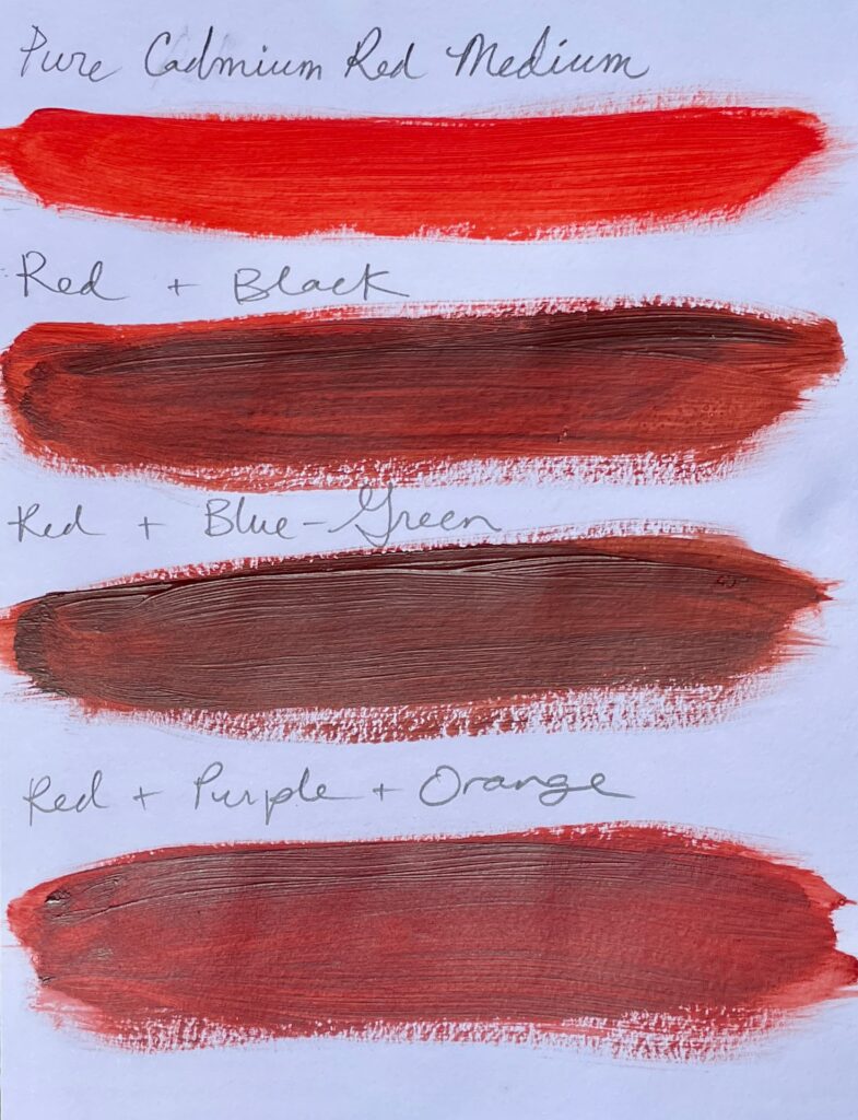
The Balance Method: Red + Blue + Green
Another method to make maroon is by using red, blue, and green. Since green is a secondary color made from blue and yellow, it helps to neutralize the red while blue makes it more cool. Add more red to warm this mix to achieve the maroon/warmth you desire.
The Unorthodox Method: Red + Purple + Orange
The last method we’ll visit is creating maroon from red, purple, and orange. Purple, made from red and blue, deepens the color, while orange, a mix of red and yellow, warms and brightens it. This is a version of the red, blue, and yellow combination from above yet it’s the mix that I think looks most different. I quite like the color it makes, though it might be slightly off from a true maroon.
Key Takeaways
Mastering how to make the color maroon opens up a world of possibilities for your artwork. By experimenting with different color combinations and techniques, you’ll develop a deeper understanding of how to lighten/darken colors and how to make them more warm or cool and enhance your painting skills.
If you enjoy this deep understanding of color theory and want to dive even deeper, check out my course Abstraction Beyond Boundaries. In this course, I teach students how to master color, composition, and techniques to create masterful abstracts. Learn more about the course here.
So pick up your palette and brushes and start mixing your very own maroon today! Happy mixing!
ABOUT ANDREA CERMANSKI
I am an artist out of Santa Fe, New Mexico who has been painting for almost 30 years. I love to teach first-timers as well as experienced painters who need a creative reboot. My work has been displayed in several galleries around the country, and I have a Bachelor’s in Art History, a Master’s in Art Education, and had my work in a show juried by Judy Chicago. The idea of getting more people painting makes me light up as I want to inspire more people to express their creative selves.
WANT TO LEARN MORE?
- Subscribe and get one of the FREEBIES below!
- PDF explaining How to Use My 5 Favorite Mediums
- Ebook on How to Move From Representational Painting to Abstraction: 5 Transformative Art Lessons
- 8 Colors Every Artist Should Have: My list of BEST colors to buy and pro mixing tips
- Check out My Online Abstract Painting Course
- Read More Painting Tips Blog Posts
- Check out My Paintings & Art Prints for Sale
- Follow Me On YouTube, Instagram, or Pinterest
