

What separates a painting that stops someone in their tracks from one they walk right past? Often, it comes down to a single word: texture. Not the kind you fake with a brush stroke — the kind you feel even before you reach out to touch it. The kind that makes a viewer lean in, tip their head sideways, and whisper, “Wait — what is that?”
Here’s a truth that art school doesn’t always teach: some of the most powerful materials you can bring to your canvas aren’t sold at a fine art supply store. They’re found on a hike in the mountains, at the bottom of your morning coffee cup, and in the recycling bin by your front door. Unconventional textures have driven some of the most compelling work in contemporary art — and they remain one of the most underused, underappreciated tools available to abstract painters today.
In this post, I’m sharing three of my favorite textures for abstract painting: sand, newspaper, and coffee grounds. I’ll show you how I use them in my own work and explain why leaning into unexpected materials is one of the most powerful creative decisions you can make as a working artist.
Why Unconventional Materials Make Your Art Stand Out
Let’s start with the big picture. The contemporary art world is saturated. Instagram feeds scroll infinitely. Galleries receive thousands of submissions. Collectors have seen everything — or think they have.
When every artist has access to the same tubes of Cadmium Red and Titanium White, the same flat brushes and palette knives, the same brand of stretched canvas, the baseline for “just a painting” is alarmingly similar. Technique can differentiate you, of course. So can composition, color theory, and years of relentless practice. But one of the fastest, most authentic ways to carve out a visual identity is to bring materials into your work that no one else is using — or that carry meaning specific to your story, your landscape, your life.
When unexpected materials are part of a painting, something shifts immediately. The viewer senses it even if they can’t articulate it. There’s a weight to the work that no commercial texture paste can replicate. A grit, a warmth, a physicality that speaks of real places and real processes. It feels alive in a way that work made entirely from conventional materials often doesn’t.
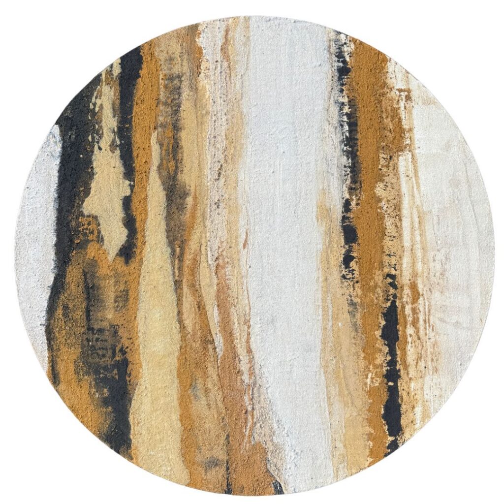
There’s also the dimension of storytelling. A painting made with sand from the arroyos of northern New Mexico doesn’t just look like the Southwest — it is the Southwest, in a literal, physical sense. Part of the land is embedded in the surface, just like you see in Ponderosa above. That’s a profound thing to offer a collector. It transforms the artwork from decoration into documentation, from object into experience.
The Medium That Makes It All Work
Before we get into each material, one thing worth knowing: the secret to making unconventional textures adhere properly and last archivally is Golden’s Matte Medium. It acts as both a binder and an adhesive, holding particles and materials securely in place while drying clear with a soft, non-reflective finish that lets the texture — not the medium — do the talking. You mix your chosen material into it, apply it to areas of your canvas where you want to create visual interest, and something ordinary becomes an extraordinary surface element. For the full breakdown of how I use Golden’s Matte Medium alongside four other essential acrylic mediums in my practice, grab my free 5 Mediums Guide.
Texture #1: Sand
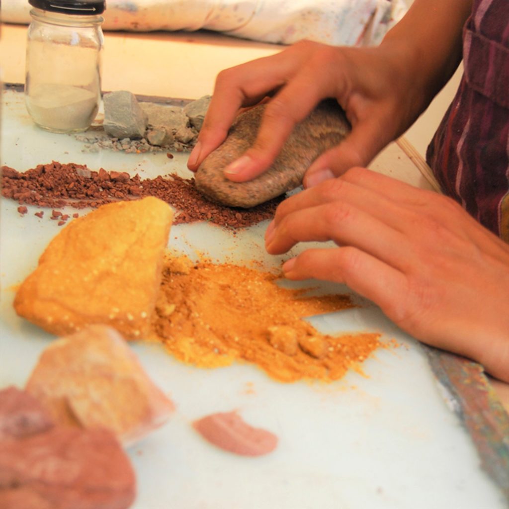
Sand is perhaps the most intuitive unconventional texture for abstract painters, and the most versatile. Depending on its grain size and mineral composition, sand can create effects ranging from the finest, most delicate shimmer to a rough, almost stucco-like surface.
What makes sand particularly powerful as a painting material is that where you collect it matters as much as how you use it. Sand gathered from a specific arroyo, a particular stretch of coast (be sure to wash out the salt), a trail you’ve walked a hundred times — that provenance becomes part of the painting’s story. The material carries the memory of the place.

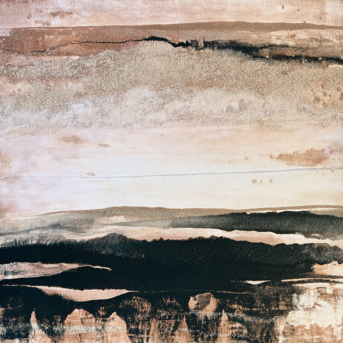
You can see this directly in Layers of Memory, a 36″ x 36″ original painting on canvas made entirely with natural pigments. The horizontal bands of warm taupe, dusty cream, and deep black move across the surface like geological strata — each layer a record of time and place. That near-black isn’t paint from a tube. It comes from charred tumbleweeds, burned and ground down into pigment, then mixed with medium and applied to the canvas. The desert gives even its fire to this work. Sand creates the gritty, luminous passages in the upper registers, catching light differently at every hour of the day. Layers of Memory doesn’t just reference the Southwest landscape — it’s made from it, literally and completely.
Texture #2: Newspaper
Newspaper is one of the most overlooked texture materials in abstract painting — which is exactly what makes it so interesting. It’s everywhere, it’s free, and in the hands of a painter who understands how to work with it, it creates surfaces with a layered complexity and subtle visual depth that straight paint rarely achieves on its own.
There’s a long art historical tradition behind this idea. Collage has been part of serious painting practice since the early twentieth century — Picasso, Braque, and the Cubists incorporated fragments of newspaper into their work not just as texture but as meaning, letting the printed word and image bleed into the painted surface and create new kinds of tension. When you introduce newspaper into an abstract painting today, you’re working in that same spirit, whether the text is legible or completely buried under subsequent layers.
What newspaper offers texturally is a thin, fibrous surface that responds beautifully to paint and medium. Applied with medium, torn or cut newspaper fragments adhere to the canvas and create a subtly uneven ground — raised edges, overlapping layers, and the ghost of printed text visible beneath translucent glazes of color. The texture is quieter than sand or coffee grounds, more architectural than organic, but it adds a real sense of history and depth to a surface that might otherwise feel flat.
The torn edge of newspaper is particularly expressive. Unlike a cut edge, which is precise and intentional, a torn edge is ragged and unpredictable — and in abstract painting, that kind of controlled accident is often exactly what a composition needs to feel alive. You can build up multiple layers of torn newspaper in different directions, creating an underlayer of visual information that the final painting sits on top of and partially reveals.
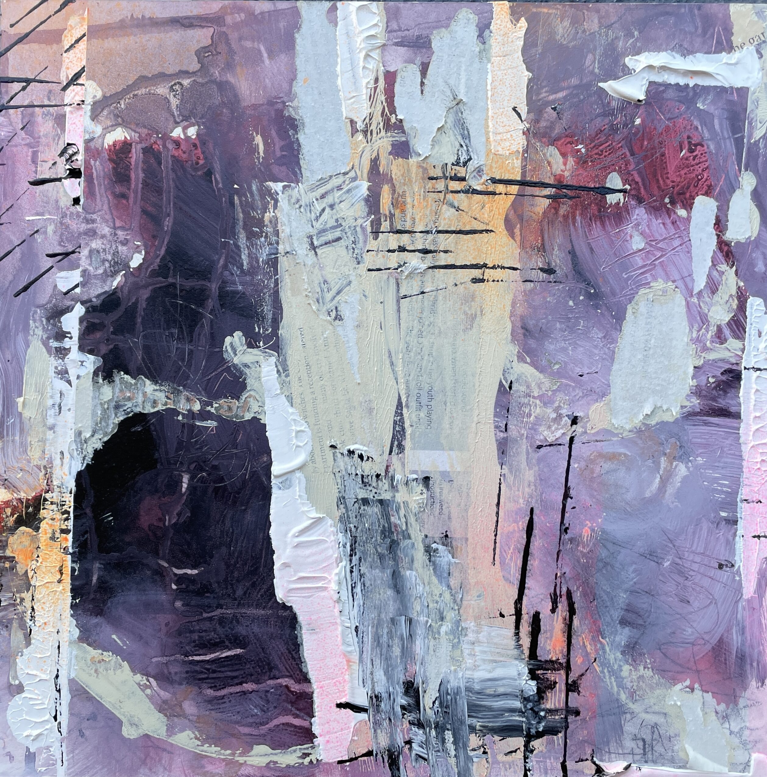
You can see this effect in a current work in progress — a layered abstract in purples, lavender, and orange where torn newspaper fragments are visible beneath translucent washes of paint, their ragged edges and glimpses of printed text surfacing through the composition like fragments of a half-remembered story. The newspaper isn’t hidden or fully buried — it’s part of the visual conversation, a structural element that adds both physical texture and a quiet undercurrent of the everyday. The torn edges lift slightly off the surface, creating subtle ridges that catch the light and give the work a depth that no amount of brushwork alone could produce.
Texture #3: Coffee Grounds
Coffee grounds may be the most accessible texture on this list, and possibly the most underestimated. If you drink coffee — or even if you don’t — this material is one trip to a café away.
Used coffee grounds have a rich, warm brown color that spans from golden tan to nearly black depending on the roast, and their texture is fine, irregular, and slightly clumped — creating wonderfully organic, unpredictable patterns when mixed into medium. Because they’re organic material, they introduce a quality of randomness that’s nearly impossible to achieve with commercial texture products. No two applications ever look quite the same.
Coffee grounds work beautifully in areas of a composition where you want to suggest earth, shadow, depth, or weight — the darker, quieter forces that give a painting gravitas. After the grounds have dried, you can mix them into medium and apply them to your substrate with a palette knife or brush. The end result is a dry, dense, tactile layer that catches raking light dramatically and invites the viewer to move closer and look harder. There’s an intimacy to coffee-ground texture — it draws people in and rewards the attention.
There’s also something quietly poetic about the material itself. Coffee is one of the most universally shared human experiences — a daily ritual across cultures and continents. Incorporating it into a painting brings that quality of the everyday into the work in a way that feels genuine rather than contrived.
The Bigger Idea: Making the Material Part of the Story
Here’s what all three of these textures have in common: they make your work impossible to fully replicate. And in an era of digital reproduction, AI-generated imagery, and endless commercial art, irreproducibility is one of the most valuable qualities a painting can have.
When every artist uses the same commercial materials in the same ways, the work converges toward a shared visual language. There’s nothing wrong with that — tradition has given us extraordinary things. But if you want your work to be genuinely memorable, genuinely yours, you have to be willing to bring something to the canvas that no one else is bringing. Something specific to your landscape, your daily life, your relationship with the physical world.
Unconventional textures do that. Sand carries the memory of deserts and oceans. Newspaper carries the layered noise of human culture. Coffee grounds carry the ritual of your mornings. Each of these materials tells a story before the paint is even applied — and when you bind them to your canvas and build a painting over and around them, that story becomes part of the finished work forever.
That’s not just a painting technique. That’s a philosophy. And it’s the philosophy behind everything I make.
Want to Go Deeper?
If this sparked something for you, I created a free guide on my 5 Favorite Acrylic Mediums specifically to help artists understand which acrylic mediums to reach for — and why — when working with unconventional materials like these. Golden’s Matte Medium is just one of the five.
Download the Free 5 Mediums Guide →
Original paintings made with sand and other unconventional materials — including Layers of Memory— are available in my shop. Each one is a little piece of the Southwest, waiting to find a home.
Andrea Cermanski is a Santa Fe-based artist working in abstract and landscape painting with sand, found materials, and unconventional textures. She teaches painting workshops and offers original paintings, fine art prints, and commissions through her website.

Thank you for this. Your poetic directive to witness and express our own personal truths through such elements is a splendid reminder to slow down, step back and reach deeply within.
Your generosity of spirit is wonderful.
Thanks so much for saying that. Hope you enjoy using texture.
I’m so excited to use these natural items
Can’t wait to see how it turns out!
Big love for this list! Way back when I started experimenting with your five favorite mediums. Media? They have made all the difference for me.I have a bunch of sand and forget to figure out how to incorporate it. Thanks for these reminders.
You are welcome! In art, the correct plural is mediums (not media). I know, confusing!