

How to Know If Your Painting is Finished (And Good)
Knowing when you a painting is done can be tricky, especially if you are doing abstract work. While painting a landscape from a reference image provides the artist with a roadmap, abstraction is open-ended and the end point is often a bit subjective. After painting for 28 years, 18 of which have been in abstraction, I have developed the ability to know when my work is finished, and it’s based on these principles below.
-
Color Balance
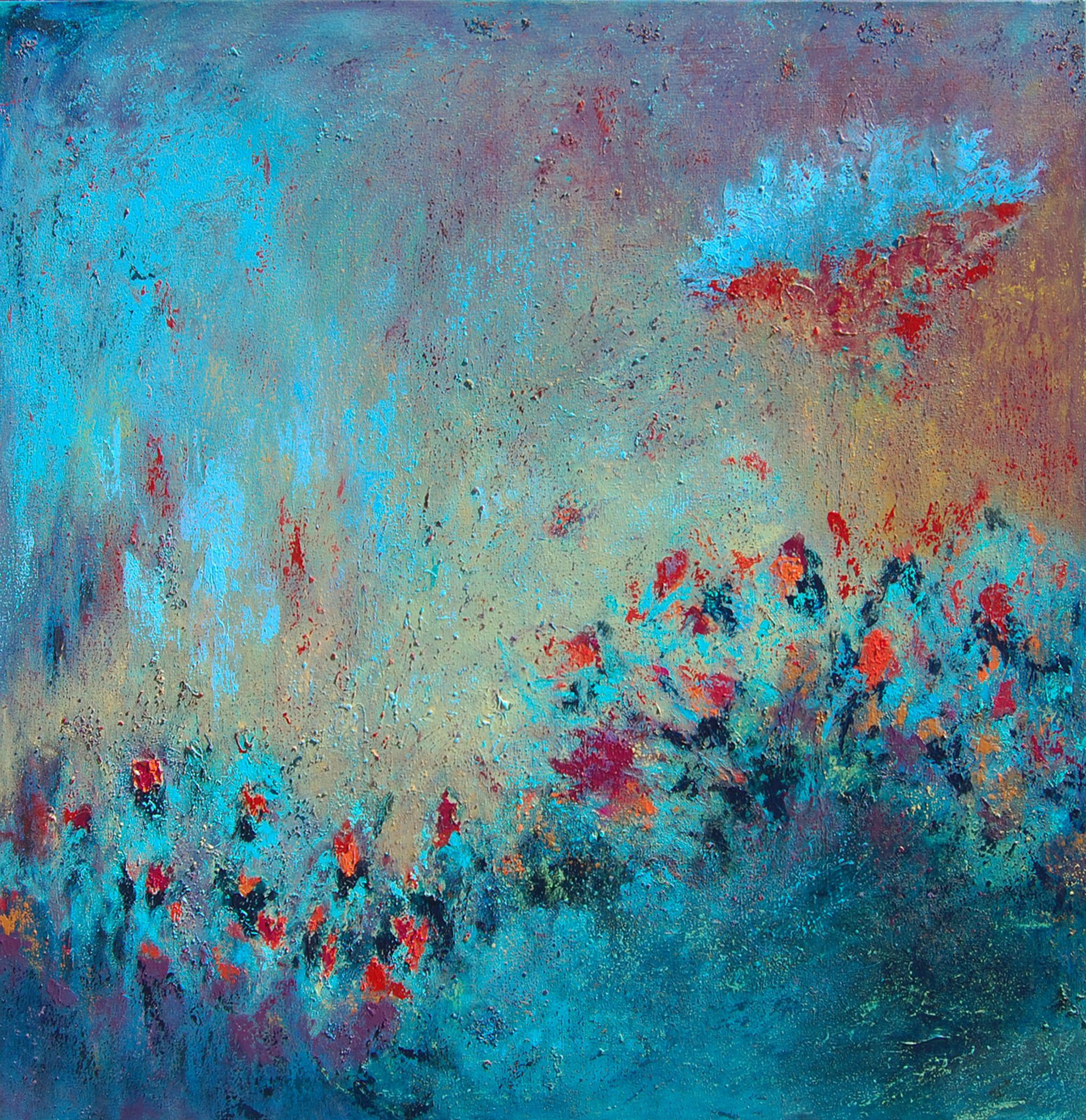
One of the elements that you want to be sure your painting has is balance of colors and/or values. I like to repeat the main colors throughout my painting, and apply them asymetrically. So if I have yellow on the top left, I will also try to apply a bit of that yellow down on the bottom right as well. I also try to have a predominant color that is used the most in the piece, and then a few other colors that complement it. For example, in my painting below, entitled In Flight, the predominant color used is the light blue. It’s on the right in the Rule of Thirds area, and is used all along the left side, and is spattered throughout on the bottom. Notice that I vary the size and type of the marks made with light blue so that there is contrast. Red is also a significant color in the piece, and it is used mostly in the top right, but is also used sparingly in the middle/bottom area. In this particular painting, the warm and cool colors balance eachother, and there are value changes between light blues, warm yellows and bright reds that create contrast.
2. Value Balance
I use a lot of different values in my abstract landscape paintings because I like to create a sense of depth and visual drama. Let’s move back to the world of realism for a moment: when drawing a person’s face, for example, it will only appear 3-dimensional if the face has shadows, mid-tones and highlights. If you apply this rule to your abstract paintings, you will add finesse to your work. A painting without enough highlights or dark tones can appear lackluster, so this is an important step. In the painting above, my dark tones are dark blue and under the flowers, as well as in the bottom right and top left. The mid-tones are the reds and oranges of the flowers, and the turquoise color. Finally, my highlights are the light blues that are spread throughout the piece. All this different values give the piece a sense of depth.
3. Visual Weight
A finished artwork should have the appearance of visual weight balance. The appearance of visual weight in an artwork is created through the colors and sizes of shapes/lines that are used. Large dark shapes or lines will appear heaviest, while light small shapes or lines will appear lightest. The combination of your marks and colors together should feel balanced. In the painting above, the light blue and red form in the top right appears quite heavy because it’s so large, however, the same light blue color used on the left side of the painting is lighter because the marks are smaller and more sparse.
4. Negative vs. Positive Space
Negative Space is the space around the subject in an art piece. Positive space is the area of interest and is made up of the actual forms and marks that you put in the painting. I find that having negative space in my paintings gives the eye a place to rest, and allows the viewer to focus on the details that I placed in the positive space. I
f the piece is full of marks and forms, the piece might appear too busy. Too much negative space could make the arwork appear unfinished or boring. There is no rule to how one can balance negative space, but generally speaking, be sure to include some negative space so that your subject can stand out. In the example painting above, the light blue, warm yellow and light purple color act as the negative space.
5. Unity
The culmination of the four elements above should give your piece a sense of unity. Unity is when all the elements appear to come together and feel unified. For me, when I do that last brushstroke that brings unity to the piece, I will often feel overwhelmed and gasp. Other times I will blurt out, “Yes!” When I get that feeling, I know the piece is done. I love when this happens, but sometimes knowing where the piece is done or not is more subtle.
Sometimes I have to live with the piece for a few weeks to see if it’s actually finished. I hang my piece on the wall in a place in my house which I pass by often, such as the living room. This gives me the opportunity to see the piece in different light throughout the day.
If your painting is hidden in the studio, you won’t get the chance to give your piece this last test of completion. Sometimes it takes a month before I determine if the piece is finished or not, but living with the painting is aluable and allows you to see if any more work, if any, is needed.
One thing to note here is that if your piece is finished, it doesn’t mean you can’t add a little touch up. Sometimes you need to dab a little more of a color in, or reduce something back; this refinement is just part of the process.
Varnishing Your Painting
When your piece is done and no more elements will be added, then you should consider varnishing it. Varnish adds a protective layer to your painting, and also allows you to control the final sheen of the piece (matte, satin, glossy). Many high quality varnishes include UV light protection, which is important if you want your colors to stay true for many years to come.
In most cases, a painting needs to dry at least a week before varnishing. I like Golden Varnish products. If you want to use a water-based product, then Golden’s Polymer Varnish with UVLS is a good choice—it comes in gloss, satin and matte. Golden has detailed instructions for how to apply the varnish, and there is a toll-free number you can call to get help if needed. I have used this product for many years, and the only thing I don’t like is that at times the varnish shows very small bubbles that I have to pop manually or just leave in the piece. This is probably due to me not mixing the varnish perfectly, but this is one drawback of the product.
How to Use Golden’s Polymer Varnish
Two layers of varnish are recommended, always starting with gloss first. You must allow at least 4 hours of dry time between layers. For the second layer, I often mix 75% gloss and 25% satin to get the sheen that I like. The second layer is usually much easier to put on. The final product looks good and the piece feels very protected. I also like this varnish because you can work back over it if you decide to. I have done this before and loved the final result because the varnish acted as an isolation layer and the final piece had a beautiful luminosity.
Golden also makes spray varnishes in the same sheens above. This varnish is substantially easier to use, and I’ve been using this one more lately. However, I find that I use up the varnish more quickly, so this option might be a bit more expesive than the Polymer Varnish.
Finally, Golden’s mineral-spirit based varnish is MSA Varnish with UVLS is an amazing product. It applies smoothly and makes the piece look beautiful. If you don’t mind working with oils, this is a great varnish to consider!
Conclusion
If you are lucky, you will know immediately when that last brush stroke finished your painting. However, if you are not sure if your artwork is finished, I recommend asking these five questions:
-
Does my piece have color balance?
-
Does my piece have value balance?
-
Is my piece balanced in visual weight?
-
Are the negative and positive spaces balanced?
-
Does my piece seem to have a sense of unity?
If you can answer yes to all of these questions, then congratulations, your piece is finished! Remember that if you are working abstractly, whether or not a piece is finished can be subjective. It’s most important to go with your intuition and personal preferences when answering the above questions, though a seasoned artist’s opinion would be helpful, too. Regardless, celebrate the completion of an artwork, and get moving to the next one!
ABOUT ANDREA CERMANSKI
I am an artist out of Santa Fe, New Mexico who has been painting for almost 30 years. I love to teach first-timers as well as experienced painters who need a creative reboot. My work has been displayed in several galleries around the country, and I have a Bachelor’s in Art History, a Master’s in Art Education, and had my work in a show juried by Judy Chicago. The idea of getting more people painting makes me light up as I want to inspire more people to express their creative selves and tap into a place of joy and calm.
WANT TO LEARN MORE?
- Subscribe and get one of the FREEBIES below!
- Ebook on How to Move From Representational Painting to Abstraction: 5 Transformative Art Lessons
- Take the Quiz: What Abstract Artist are you Destined to Be?
- Break Free and Breathe: Type-A Guide to Artistic Play. Powerful exercises to loosen you up to create better abstracts.
- Check out My Online Abstract Painting Course
- Read More Painting Tips Blog Posts
- Check out My Paintings & Art Prints for Sale
- Follow Me On YouTube, Instagram, or Pinterest
