


How to Make More Sophisticated Paintings with Depth
Creating a sense of deep space in a painting is a great way to add sophistication and drama to your artwork. Regardless if you are a realistic or abstract painter, do portraits or landscapes, these general rules will help to create instant depth in your artworks.
1. Value
Use Dark Colors in Background, Lighter Colors in the Foreground. A value is the relative lightness or darkness of a color. When an art piece has different values, such as shadows and highlights, an illusion of depth is created. Therefore, if you are trying to create deep space in a painting, you will want to be sure you had a variety of light, medium and dark value colors. If you think about drawing a still life of apples, the apples would look flat if they were shaded with all the same value of pencil. However, when you add the highlights to and shadows to the apple, it pops and looks 3-dimensional. This rule carries over into abstract painting as well. Generally, using dark colors in the background and lighter ones in the foreground (or vice versa) will give the art piece a sense of deep space.
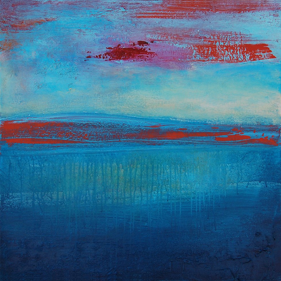
Notice how the dark blue value at the bottom of the painting gradually fades to light, thus creating a sense of depth at the bottom, and more shallow space at the top. Submersion, Acrylic on Canvas, 20” x 20”, Andrea Cermanski
2. Size
Paint both Large and Small forms to Create a Sense of Depth. Large forms appear close to the viewer, and smaller ones appear further way. Similarly, when you use thick brush strokes those tend to appear closer to the viewer, while thin strokes move to the background. This simple technique will make a substantial difference in the creation of deep space in an artwork.
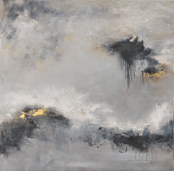
In this painting, the black form on the top right is the largest, and appears to be closer than the one below it. Also, notice how the small, translucent drips at the bottom appear to be in the distance, while the darker drips at the top also appear closer. Iron Oxide III, 36” x 36”, Acrylic & Gold Leaf on Canvas. Andrea Cermanski
3. Color
Use Cool Colors in the Background, Warm Colors in the Foreground. Cool colors, such as blues and purples, will move back in the picture plane, while warmer colors such as red, orange and yellow will move forward. Therefore, if you paint a blue sky and a field with orange flowers, the sky will seem to appear behind the flowers. In addition, using both cool and warm colors in your artwork gives the piece contrast, both in color and value.
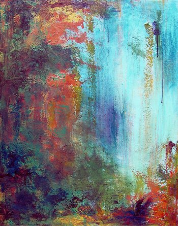
In this painting, the orange, yellow and purple red natural forms appear to be closer in the picture plane than the light blue sky. Lagoon, Acrylic on Canvas, 30” x 24”, Andrea Cermanski
4. Overlapping
Overlapping one object over another creates the sense that it is closer in the picture plane. This layered effect also adds visual complexity and visual interest in your painting. For example, if you drew two circles, and one overlapped the other, then the full circle would appear closer.
5. Positioning
Generally, objects that are lower in the picture plane will appear closer, and those at the top appear further away. As humans our perception is based on gravity that pulls us down to the earth, and therefore we associate objects at the bottom of the picture plane as being on the ground, and those at the top, or above the horizon line, as being in the sky/further away.
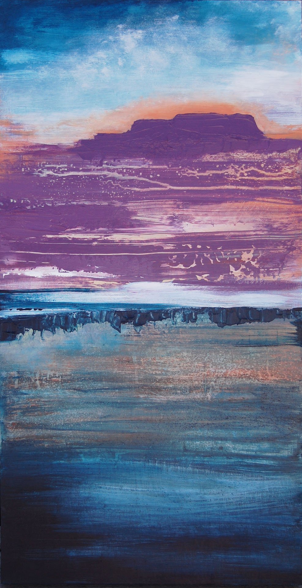
In this painting, everything below the horizon line appears to be closer to the viewer, while the purple mesa at the top and the sky appear further. Desert Reflection, Acrylic on Board, 32” x 16”, Andrea Cermanski
Conclusion
Implementing these techniques into your artwork is easy, and the more of these you use in one piece, the more depth you will create. As an abstract painter, I love using these techniques to add complexity to my pieces. I encourage you to give these techniques a try whenever you want to add depth to your pieces!
ABOUT ANDREA CERMANSKI
I am an artist out of Santa Fe, New Mexico who has been painting for almost 30 years. I love to teach first-timers as well as experienced painters who need a creative reboot. My work has been displayed in several galleries around the country, and I have a Bachelor’s in Art History, a Master’s in Art Education, and had my work in a show juried by Judy Chicago. The idea of getting more people painting makes me light up as I want to inspire more people to express their creative selves and tap into a place of joy and calm.
WANT TO LEARN MORE?
- Subscribe and get one of the FREEBIES below!
- PDF explaining How to Use My 5 Favorite Mediums
- Ebook on How to Move From Representational Painting to Abstraction: 5 Transformative Art Lessons
- 8 Colors Every Artist Should Have: My list of BEST colors to buy and pro mixing tips
- Check out My Online Abstract Painting Course
- Read More Painting Tips Blog Posts
- Check out My Paintings & Art Prints for Sale
- Follow Me On YouTube, Instagram, or Pinterest

Thank you! Good info and easy to understand!
You are very welcome, Patty!
So helpful. Many thanks++
You are very welcome, Jan!
Andrea, you make the concepts easy to understand because you immediately show an example and point out how it illustrates the concept. Great information that I’ll print out and use in future paintings and fiber art. Thank you. Sylvia
Syliva, I am so glad to hear that feedback, and am thrilled that the examples are helping you learn!