Learn to Use Color Better by Studying Van Gogh
Not many people could deny the fact that Van Gogh was an amazing colorist. He was a master of creating contrast with color and texture, and also used color symbolically, which we know from his letters to his brother Theo. My background in Art History has lead to a great interest in his work, which I have studied over the years. This article will explore how Van Gogh created vastly different feelings in two paintings: Olive Trees and The Night Cafe.
Color Theory Wheel Basics
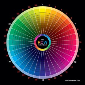
Here are some color scheme basics so that we are on the same page. While there are several other color schemes, this article will only discuss two: complementary and split-complementary. I highly suggest purchasing a “color computer” color wheel so you can easily identify color schemes and color mixes.

Complementary Colors–Colors opposite each other on the color wheel, such as purple and yellow. These color sets are the highest contrast on the color wheel.
Split-Complementary Colors–In a split-complementary color scheme, the artist would choose one color to use, go across the color wheel and “split” the complement. For example, if red was one of the colors you wanted to use, to choose the other colors in a split complementary color scheme, you would go directly across the color wheel and find green.
Then you would choose the colors on either side of green to use in your artwork: yellow-green and blue-green. Therefore, the colors you would mostly use in this scheme would be red, yellow-green and blue-green.
One thing to note is that when an artist uses a color scheme, it doesn’t mean that other colors can’t be in the artwork, and this is true of Van Gogh’s color use as well. Using a color scheme is more about the predominant colors in the piece.
Van Gogh & Color Schemes
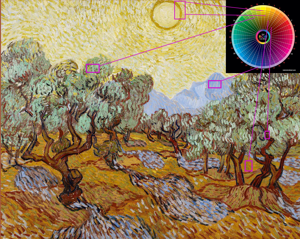
If you analyze Van Gogh’s work, you will find that he used a variety of color schemes to create moods and various effects in his paintings. Let’s explore Olive Trees (1889, Oil on Canvas), a piece in which Van Gogh uses a loose split-complementary color scheme.
Light purple is a significant color in this scheme. Even though it’s not used as much as the warm colors, Van Gogh places the purple mountains in the center of the piece, and then adds the same color to the ground.
This light purple color stands out in contrast to the rest of the piece, which is mostly comprised of warm colors. Even the green is a neutralized yellow-green, and is warmer than typical greens as a result. The purple stands out starkly agains the yellow sky since the two are complements.

Let’s split the complement, purple, now. Going across the color wheel, we find yellow, and then look on either side of yellow to find yellow-orange and yellow-green. Now, take a look at the painting and notice there are many colors that range from yellow-green to yellow-orange.
As one of the few cool colors, the light purple stands out distinctly against the rest of the colors. This is not a strict split complementary color scheme, but it’s close and you can see how well these colors work together.
Something else to note here is that Van Gogh uses quite a bit of tints (color + white) and neutrals in this painting. The yellows, greens and purples are all tints, and the bark of the trees is a neutralized orange-red (as opposed to a pure brown).
For me, what works so well in this color scheme is how the whole scene seems to be cradled in the warmth of the sun which encompasses the entire sky. The purple and yellow-green tints look beautiful together, while the warm orange-red in the tree trunks and ground seems to root the entire scene. As a result, the colors result in creating an inspiring and comforting scene.
Contrast Between Warm and Cool Colors
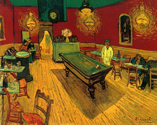
Something else Van Gogh masters is contrasting warm and cool colors with each other. In The Night Cafe (1888, Oil on Canvas), Van Gogh uses the complements red and green, along with yellow and orange that contrast with the vibrant greens in the piece. Notice how starkly the red walls contrast with the bright green ceiling and pool table. Again, this is because red and green are complementary colors.

In this painting, which is perhaps one of his most famous, I am personally intrigued by the green hair of the man standing to the right of the pool table.
In a letter to his brother Theo about the painting (September 9, 1888), Van Gogh wrote, “I have tried to express the terrible passions of humanity by means of red and green. The room is blood red and dark yellow with a green billiard table in the middle; there are four lemon-yellow lamps with a glow of orange and green. Everywhere there is a clash and contrast of the most alien reds and greens...”
With the man’s placement in the top right rule of thirds area, his green hair and bright white outfit, he stands out literally and figuratively as an important figure in this piece, although he is relatively small in size compared to the pool table and rest of the room.
Van Gogh was using colors symbolically, and also as a way to bring emphasis and visual contrast to the different elements in the painting. His brushstrokes bring energy and movement to the piece, even though it is what appears to be quite a still and sleepy scene.
Conclusion
Comparing the two paintings, notice how soothing Olive Trees is compared to The Night Cafe. The colors of The Night Cafe feel sickly and aggressive in comparison to the calm that Olive Trees portrays. And this is the power of color schemes–our color choices create moods in our paintings, and pull or viewers in, or repel them.
There are so many other paintings to analyze by Van Gogh, and I cover more of these in my online course, Abstraction Without Boundaries: Color and Composition. I go deep into color theory, how to mix colors like a pro, composition, unique painting tools and abstract painting techniques in a 4-module course that includes beautifully-designed vocabulary slide shows, painting demonstrations and access to monthly course member critiques.
If you would like to learn more about color schemes and how to use them to create feeling and emphasis in your work, then check it out!
ABOUT ANDREA CERMANSKI
I am an artist out of Santa Fe, New Mexico who has been painting for almost 30 years. I love to teach first-timers as well as experienced painters who need a creative reboot. My work has been displayed in several galleries around the country, and I have a Bachelor’s in Art History, a Master’s in Art Education, and had my work in a show juried by Judy Chicago. The idea of getting more people painting makes me light up as I want to inspire more people to express their creative selves and tap into a place of joy and calm.
WANT TO LEARN MORE?
- Subscribe and get one of the FREEBIES below!
- PDF explaining How to Use My 5 Favorite Mediums
- Ebook on How to Move From Representational Painting to Abstraction: 5 Transformative Art Lessons
- 8 Colors Every Artist Should Have: My list of BEST colors to buy and pro mixing tips
- Check out My Online Abstract Painting Course
- Read More Painting Tips Blog Posts
- Check out My Paintings & Art Prints for Sale
- Follow Me On YouTube, Instagram, or Pinterest
Very useful analysis of Van Gogh’s work.zThank you
You are very welcome! Thanks for the comment!