
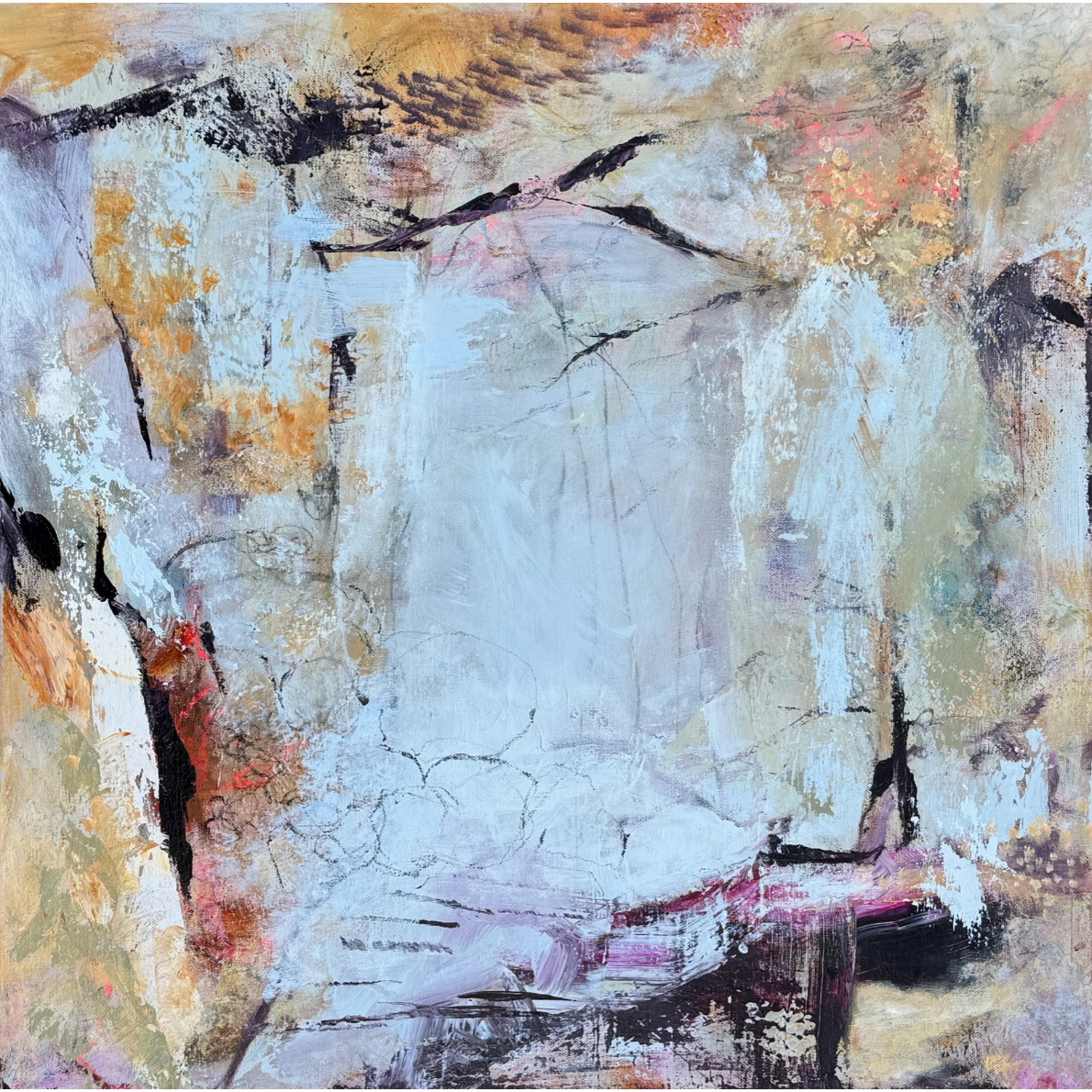
Have you ever started a painting with a beautiful color, only to cover it up completely as you worked? Or wondered why some abstract paintings seem to glow with color, even when the palette is relatively subdued?
One of my favorite ways to bring energy and unexpected color into my abstract paintings is to start with a bold, bright underpainting. And when I say bright, I mean BRIGHT.
Neon yellow-green, fiery orange, hot pink—these are some of my favorite colors to use as a base layer. They excite my eyes, energize the painting process, and influence everything that comes afterward.
Sometimes I build up so many layers that the original color disappears entirely. Other times, little remnants peek through, offering glimpses into the painting’s history. I love those moments because they reveal something about how the painting evolved, even if the viewer has no idea what the original color was.
But there’s more to this approach than simply making a painting colorful. Starting with a bold underpainting can actually change the way you paint.
Why Start With a Bright Underpainting?
1. It encourages expression rather than representation.
In traditional landscape painting, artists often begin with a neutral underpainting, such as raw or burnt umber. These earthy colors can help establish values and provide a foundation for building a realistic image.
There’s nothing wrong with that approach, of course. But when I’m painting abstractly, I want to start from a different place. I’m not trying to reproduce exactly what I see. I’m interested in expressing something through color, shape, texture, and movement.
Starting with bright purple or neon yellow immediately takes me away from the familiar. It reminds me that I’m not obligated to make the painting look like anything in particular.
And that’s a pretty liberating way to begin.
2. It encourages risk-taking from the very beginning.
Think about how you feel when you approach a blank white canvas. For many artists, there’s a little hesitation. Where should I start? What color should I use? What if I make the wrong decision?
Now imagine covering that entire canvas with bright turquoise.
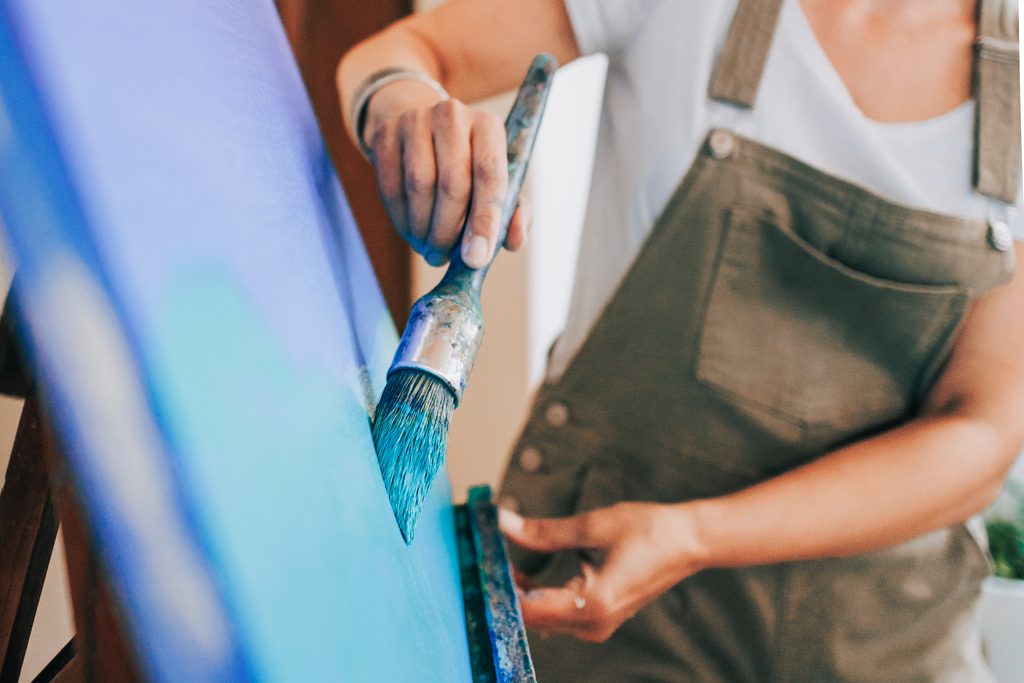
You’ve already made a bold decision. You’ve taken a risk before you’ve even begun developing the composition.
I find that this first expressive choice sets the tone for everything that follows. It puts me in a mindset of experimentation rather than caution. I’m more willing to try unusual color combinations, make unexpected marks, and see where the painting takes me.
And when you’re working abstractly, that willingness to experiment is incredibly valuable.
3. It helps you stay in an abstract mindset.
One of the challenges I see with students who are transitioning from representational painting to abstraction is the tendency to make things look recognizable.
They might start with the intention of painting an abstract landscape, but before long they’re carefully defining mountains, trees, and clouds.
A bright, unexpected underpainting can help interrupt that habit.
When you’re working over a hot pink or neon yellow-green surface, you’re already dealing with something that doesn’t necessarily correspond to the colors of the natural world. It can make it easier to think about color as an expressive tool rather than something that needs to be accurate.
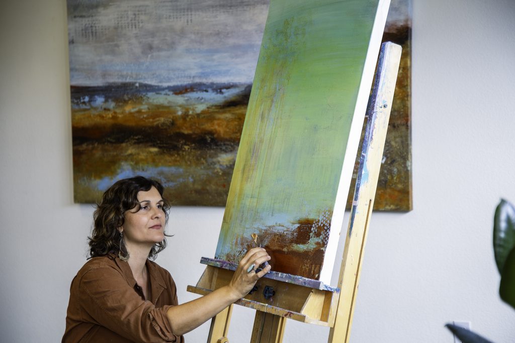
Of course, a bright underpainting won’t automatically make your painting abstract. You still need to consider composition, value, contrast, and the relationships between shapes. But it can help you approach those decisions with a little more freedom.
4. It creates unexpected color relationships.
This might be my favorite reason of all.
When you paint over a bright underpainting, the original color can influence the layers above it in surprising ways.
For example, if you glaze a translucent blue over a red underpainting, the result may appear purple. Add a thin layer of green over that same red, and you might get a warm, brownish color.
These effects happen because light passes through the translucent layers and interacts with the colors underneath. Instead of mixing every color on your palette, you’re allowing some of that color mixing to happen directly on the painting surface.
The result can be a richness and complexity that’s difficult to achieve with a single layer of paint.
I especially love how little bits of the original color can peek through between brushstrokes or along the edges of shapes. These small accents can bring an unexpected vibrancy to an otherwise quiet area of the painting.
And sometimes, those accidental color combinations end up being my favorite parts.
A Look at My Painting: The Space Between
Here’s a recent painting I finished called The Space Between.
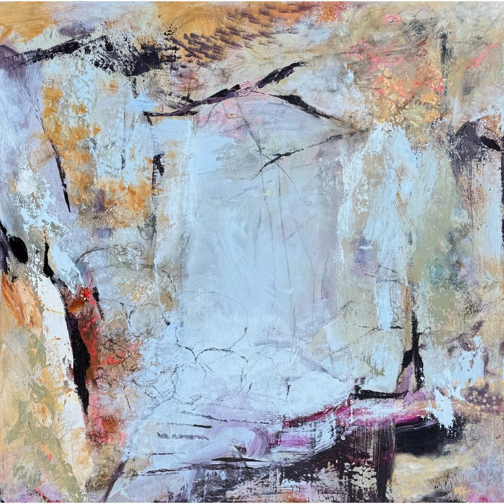
Take a look at the magenta near the bottom right of the painting. That was the original underpainting color!
Most of the magenta has been covered by subsequent layers, but I love that some of it remains visible. It’s a little reminder of where the painting began.
Look more closely at the middle and middle-left sections. You’ll notice areas where translucent light blue has created soft violet tones, and places where ochre layered over the magenta has produced warm, peachy colors on the right.
These subtle color variations are part of what makes the painting interesting to me. There’s a conversation happening between the layers, and the colors are doing things I couldn’t have entirely predicted when I started.
I also love the contrast between those little flashes of magenta and the quieter blues, creams, and earthy tones that dominate the finished piece. The magenta adds a spark of energy without overwhelming the composition.
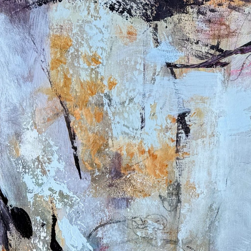
That’s an important distinction. A bright underpainting doesn’t mean you need to end up with a bright painting. Sometimes the most exciting results happen when you allow just a few small areas of that original color to remain.
Knowing when to preserve those little surprises—and when to cover them—is part of developing your artistic judgment.
The Easiest First Step in Abstract Painting
I often tell my students that the easiest step in abstract painting is the very first one: choosing a color and covering the canvas.
There’s no composition to worry about yet. No difficult decisions about what to keep or remove. Just you, your paint, and a color that makes you happy.
I usually choose whatever color jumps out at me first. It’s an intuitive decision, and I don’t spend much time questioning it.
Of course, as the painting develops, I become more intentional about my choices. I consider how the colors relate to one another, where I need contrast, and which areas need more or less visual activity.
That’s the balance I’m always working toward in my abstract paintings: allowing room for spontaneity and discovery while using my understanding of color and composition to bring the painting together.
The initial color choice is just the beginning, but it can have a surprisingly big influence on the journey.
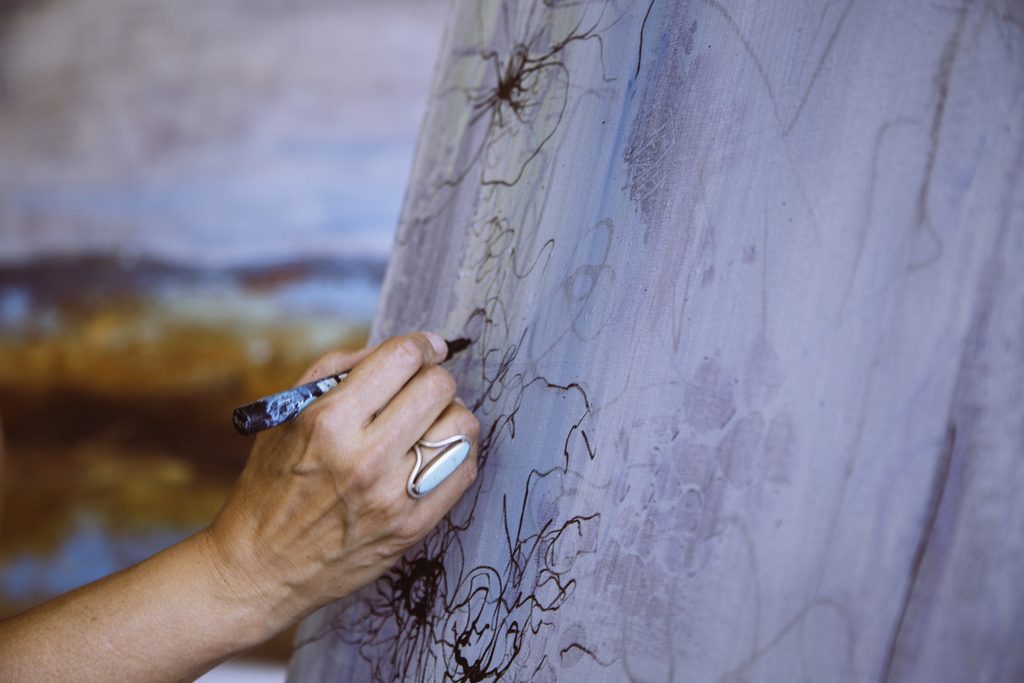
Your Turn: Try a Bold Underpainting
For your next abstract painting, I have a little assignment for you.
Choose a bold color that you wouldn’t normally use as an underpainting. Maybe it’s fluorescent pink, electric lime green, or a brilliant orange.
Cover your canvas with it, let it dry, and then begin painting as you normally would.
As you build your layers, pay attention to how the underpainting influences the colors you add. Experiment with translucent glazes as well as opaque passages. Notice what happens when you allow little pieces of the original color to remain visible.
And most importantly, observe how starting with such an expressive color affects your painting process.
Do you feel more adventurous? Are you making different color choices? Does it help you loosen up and experiment?
You might be surprised by what happens.
Remember, the goal isn’t necessarily to preserve the original color. It’s to let that color become part of the painting’s history, whether it remains visible or disappears beneath the layers.
Give it a try, and let me know how it goes. I’d love to hear what color you chose and what you discovered along the way.
Happy painting!
Andrea
Ready to Create Abstract Paintings with More Confidence?
Love abstract art but struggle to make your own paintings come together? Join me for my FREE training, The 5 Missing Pieces Between You and Painting Abstracts with Confidence. I’ll share practical strategies to help you create stronger compositions, make more confident creative decisions, and develop paintings that feel uniquely yours.
About Andrea Cermanski
Andrea Cermanski is a Santa Fe-based abstract painter, gallery-represented artist, and founder of Santa Fe Painting Workshops. With nearly 30 years of painting experience and more than 20 years of teaching, she helps artists understand the foundational principles of composition, color, and design so they can create compelling abstract paintings with greater confidence.
Andrea holds a bachelor’s degree in Art History and a master’s degree in Art Education. Her work has been exhibited in galleries around the country, and she teaches artists through online courses and in-person painting workshops in Santa Fe, New Mexico.
Leave a Reply
Subscribe to get painting tips and news about my latest artwork & upcoming events.
Follow me@santafepaintingworkshops


