

Variety in artwork is a crucial principle of design that artists and designers utilize to infuse their creations with diverse elements. This principle, closely tied to contrast, contributes significantly to the visual interest in any piece. If you’re wondering how to get better at art, understanding and incorporating variety can make a huge difference. In this blog post, we’ll explore how to create variety in your artwork, examine an exemplary piece by Jean-Michel Basquiat, and offer practical tips to enhance your artistic skills.
Prefer to watch my video tutorial about variety?
What is Variety?
Think about this: what if you ate the same exact thing for every meal of every day? That would be boring, right? It’s the same in art—when our works incorporate variety and contrast, we give viewers plenty to feast their eyes on. As famously stated by the English poet William Cowper, “Variety is the spice of life, that gives it all its flavor.” This principle of design involves adding diverse elements to artwork through different visual components.
How to Create Variety in Artworks
To add variety to your artwork, you can experiment with numerous elements:
- Variety of Colors: Use a broad spectrum of colors to create visual interest.
- Variety of Values: Incorporate a range of light to dark shades to add depth.
- Variety in Lines: Use different types and sizes of lines to create texture and movement.
- Variety in Marks: Include various marks, from large brush strokes to fine details.
- Variety in Shapes: Mix different shapes and sizes for a dynamic composition.
- Variety of Textures: Experiment with actual or implied textures to add dimension.
- Variety in Tools: Use different tools to create unique effects.
- Variety in Mediums: Combine different mediums like acrylics, oils, and pastels.
- Variety in Sheens: Play with different sheens, from matte to glossy, to create visual contrast.
Variety Artwork Example: Jean-Michel Basquiat
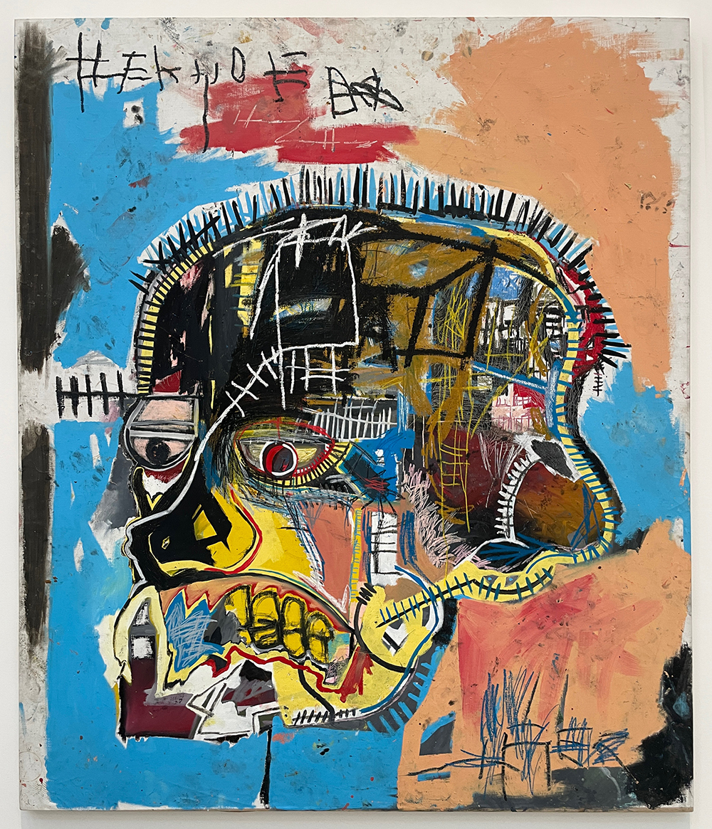
Jean-Michel Basquiat’s 1981 painting “Untitled (Acrylic & Oil Stick on Canvas)” is a prime example of variety in art. Let’s break down how Basquiat masterfully incorporates variety:
Variety of Colors
Basquiat predominantly used light blue and peach but added touches of red, yellow, white, and black. The contrast between the yellow nose and black lines is striking. While the complementary blue and orange sides create a lot of contrast and visual pop.
Variety of Values
This painting features the entire range of values, from light whites to dark blacks, with intermediate shades like yellows, blues, peaches, dark reds, browns, and maroons. Consequently, this high contrast of value makes his forms stand out distinctly.
Variety in Lines
Once again, Basquiat demonstrates variety with the many different sizes and types of lines. For example, he has short, choppy lines along the top of the head, but those lines are smaller when we look behind his head. Those short choppy lines are repeated throughout the piece in black, white, and blue, and the size varies from very small to large. In other areas, the lines resemble train tracks, ladders, and other geometric structures. Basquiat also has some curved lines, thin and thick. These contrast with the thicker lines in the geometric shape at the top right of the head, as well as scribbles in the face, around the eyes, and on the bottom right. This variety of line types and sizes adds complexity and interest.
Variety in Marks
The artwork showcases both large flat shapes and gestural brush strokes. For instance, the black in the nose area appears carefully painted, while the large peach and blue shapes seem to be created with large, sweeping, loose strokes.
Variety in Shapes
From the larger shapes like the light blue and skull shape to the very small details like the shapes defining the left eye, Basquiat uses a wide range of shape sizes. Additionally, he outlines shapes with white, as seen with the white rectangle in the cheek on the right, adding another layer of variety.
Variety of Textures
While Basquiat does not use actual texture, he creates implied textures and contrasts. The short choppy lines resemble hair, while the overlapping of white, peach, and red paint at the top resembles the texture of a concrete wall (which is where Basquiat did many of his first paintings—on exterior walls in New York City). Furthermore, the way he used his oil crayon in the blue scribbles on the bottom right gives a textured/dry brush look. We can see the orange behind the blue marks, and in the same way, the pink scribbles above this area create visual texture and interest.
Variety in Tools
Basquiat primarily used a paintbrush but also incorporated oil sticks for additional texture and contrast.
Variety in Mediums
Basquiat used both acrylic paint and oil sticks. These two mediums work well together. With the acrylic paint, he can paint large areas such as the black, light blue, and peach, while the oil stick is used for the script and scribbles. This provides the visual texture and contrast that makes his painting complex and dynamic. By combining acrylic paint and oil sticks, Basquiat achieved both broad color areas and intricate, textured details, enhancing the painting’s complexity and dynamism.
Variety in Sheen
Basquiat’s painting maintains a consistent sheen, contributing to its cohesive look. Since I saw this painting in person at the Broad in Los Angeles, I can vouch that the painting is consistent in its sheen and is relatively matte/satin.
How to Bring Variety to Your Artwork
Incorporating variety in your artwork can be achieved through several methods. While the list above is not exhaustive, using at least four of these strategies will give more variety to your work. You might also experiment with choosing four strategies for one painting and choosing four others for another. Doing this will allow you to mix and match different ideas and might lead to paintings that you wouldn’t create on your own without some boundaries. Here are some examples to get you started:
- Mix Colors and Values: Experiment with a wide range of colors and shades to create depth and interest.
- Use Different Tools and Mediums: Combine various tools like brushes, palette knives, and mediums such as acrylics, oils, and pastels.
- Play with Textures and Shapes: Incorporate both real and implied textures and use a mix of shapes and sizes to enhance your composition.
- Vary Line Types and Marks: Use different line types and marks to create dynamic and engaging artwork.
Key Takeaways
As you can see, Basquiat achieved a lot of variety in this painting. It hit seven out of the nine categories I listed above. What I love about this painting is not only the craftsmanship and skill but all of the variety and intriguing elements that pull me in and make me want to look more.
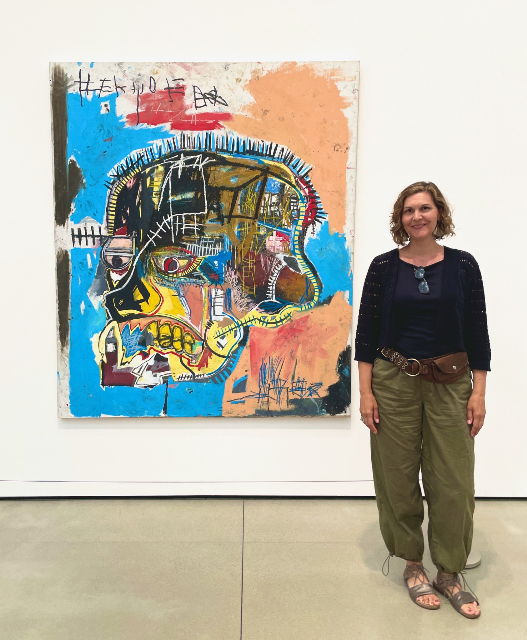
I was elated to have the opportunity to see this piece in person; not only was the piece much bigger than I had expected, but I found myself studying it so much more when I was able to stand right in front of it.
Incorporating variety and other design principles can transform your artwork, making it more purposeful and skillful. This approach keeps you experimenting and evolving as an artist. By trying out different strategies and combining them in unique ways, you can create artworks that are visually captivating and richly textured.
How do you use variety in your artwork? Share your thoughts and techniques in the comments below! By learning from each other, we can all discover new ways to get better at art and create stunning variety artwork examples.
ABOUT ANDREA CERMANSKI
I am an artist out of Santa Fe, New Mexico who has been painting for almost 30 years. I love to teach first-timers as well as experienced painters who need a creative reboot. My work has been displayed in several galleries around the country, and I have a Bachelor’s in Art History, a Master’s in Art Education, and had my work in a show juried by Judy Chicago. The idea of getting more people painting makes me light up as I want to inspire more people to express their creative selves and tap into a place of joy and calm.
WANT TO LEARN MORE?
- Subscribe and get one of the FREEBIES below!
- PDF explaining How to Use My 5 Favorite Mediums
- Ebook on How to Move From Representational Painting to Abstraction: 5 Transformative Art Lessons
- Take the Quiz: What Abstract Artist are you Destined to Be?
- Check out My Online Abstract Painting Course
- Read More Painting Tips Blog Posts
- Check out My Paintings & Art Prints for Sale
- Follow Me On YouTube, Instagram, or Pinterest
